
Bronx Science’s Color of the Year
As 2021 came to a close, students got colorful and creative to describe the past year.
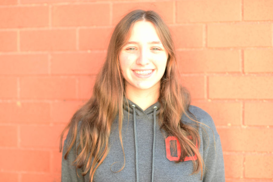
Micaela Sinayuk ’22, one of the students interviewed, thought Pantone 484 was the Bronx Science Color of the Year. “The strength shown in this red reminded me of Bronx Science students.”
Colors are representative of many things for individuals, ranging from events, emotions, and other people. Each color holds a different meaning and value to a unique individual. For instance, someone may use green to describe a terrible day when they were feeling envious. Another person may choose green to describe the calm and quiet of a good day. However, what if the idea of using a color to describe a day was extrapolated to describe the week? The month? What color represents the entire year of 2021?
Yearly, Pantone, a company that specializes in color design, matching, and production, chooses a ‘Color of the Year’. For 2021, the company chose a color combination of PANTONE 17-5104 Ultimate Gray and PANTONE 13-0647 Illuminating, a bright yellow. Leatrice Eisemann, Executive Director of the Pantone Color Institute, described the combination as “The union of an enduring Ultimate Gray with the vibrant yellow Illuminating expresses a message of positivity supported by fortitude. Practical and rock solid but at the same time warming and optimistic, this is a color combination that gives us resilience and hope.”
This description highlights the struggles and uncertainty of 2021, especially during the ongoing COVID-19 pandemic. The enduring spirit of humanity when the end seems to be nowhere in sight is a thoughtful, impactful message behind what are seemingly simple shades of gray and yellow.
Following Pantone’s yearly tradition, I grew curious to see what Bronx Science students believe the color, or colors of the year should be. What meaning do the individuals of our school hold to different colors? What color do they think is representative of an entire year of emotions, events, and everyday chaos of life? The unique diversity of the student body provided many interesting responses. The students picked from multiple colors using this chart.
It is no secret that 2021 has been a year of many losses and continues to be a dark stain on humanity’s timeline. Although the Coronavirus pandemic has impacted every aspect of 2021 and has continued into 2022 with the rise of the Omicron variant, this past year has also been a mark of hope and perseverance, as humanity continues to work towards the light at the end of the tunnel. The pandemic played a large influence in the responses received from randomly selected students.
Many students tied their chosen color to be reflective of the uncertainty people held during the darkest times of the pandemic this year. Leslie Sampaney ’23 chose Pantone 266, a dark purple because to her, “it reflects the worries and fears we have all had this year. It really encapsulates our uncertainty and hopes for positive changes in the future.”
This idea of positive change and hopefulness is something noticed by other students, though their chosen colors may have been different. Saamiya Ahmed ’22 chose a light orangey-brown, Pantone 471, because for him, “It’s warm and reminds me of how we are all back in school with our friends and can see people more. It is a very warm and comfy color.”
Camille Chen ’23 expressed the duality of 2021 through a pairing of two colors. She chose Pantone 484, a deep dark red to represent “the darker side of 2021 nature. Almost every nation was involved in the Afghanistan conflict when the Taliban took over, shedding a lot of blood and tears,” said Chen. “I feel like in 2021 there was more disorder and chaos leaving me to choose a darker and more somber color.”
Chen paired this somber red with a bright Pantone 106 yellow. “I feel like this demonstrates the more positive aspects of 2021 life, to balance out the bad; more and more people are getting COVID-19 vaccine shots, reconnecting with family, and The Tokyo Olympics happened. These things bring a little light to an otherwise solemn year, and I feel like it is important to acknowledge that, instead of focusing only on the negative,” Chen elaborated.
Micaela Sinayuk ’22 also chose Pantone 484, which she believed showcased the duality of a single color to describe the year. “This year has been full of challenges for Bronx Science students, which is represented by the dark hue. However, students have also shown strength throughout 2021, and red represents strength,” she said.
It is clear that different colors hold a unique meaning for different students. Maheen Asaf ’25 picked colors that represented how 2021 had changed him as an individual. Asaf chose a color combination of Pantone 362, a shade of green, and Pantone 278, a shade of blue. “I chose Pantone 362 because 2021 felt a bit blurred for me. Many things were happening way too fast. For instance, I was finally moving up to high school which obviously brought some mixed emotions,” Asaf said.
Asaf feels that 2021, as represented by Pantone 278, was also a year of self-discovery. “I chose Pantone 278 because it in a way represents how I’ve changed as a person. This year has been a journey for all of us, not just physically, but also mentally and emotionally. I felt this color fits the theme of self discovery,” Asaf explained.
Among the responses received, the most popular colors were all shades of blue. For students who picked two colors, the most common color combination was a shade of blue with a shade of yellow. Blue and yellow are commonly recognized to be the colors of the sky and sun, and a recurring answer from respondents was that they picked those two colors as it reminded them of nature and the outdoors after being stuck at home for a year.
Carys Chan ’25 was one of these respondents. She chose Pantone 137 and Pantone 290, a vivid yellow and a blue. “During remote learning, my entire bedroom would be bathed in this golden color from the sunlight reflecting off my floor. It reminds me of staying at home and the quarantine, but in a more positive way,” Chan said about Pantone 137. They said the blue shade was like “the shade of blue the night sky would turn when it was snowing, or had just snowed.”
However, while blue was representative of the sky for many students, Chan had another interesting reason for choosing her shade of blue. “I chose Pantone 290 because in 2021, technology suddenly became that much more important in learning,” they said. “The shade of blue is close to the one that comes out of my computer screen.”
Chan brings up a good point. The quarantine has highlighted the importance of technology for many people this year who used it to work, stay connected with family and friends, and find entertainment when the quarantine boredom hit. “I believe it represents 2021 since we were so dependent on technology for us to continue functioning,” Chan said.
As expected, the uniqueness of every interviewee shines through and Bronx Science’s Colors for 2021 is a beautiful blend of strong reds, resilient greens, digital screen blues, persevering sunshine yellows, and warm browns. This year is quite the colorful canvas. What colors will students paint next year’s canvas with?
“I chose Pantone 278 because it in a way represents how I’ve changed as a person. This year has been a journey for all of us, not just physically, but also mentally and emotionally. I felt this color fits the theme of self discovery,” Maheen Asaf ’25 explained.
Olivia Wronski is a Features Editor for ‘The Science Survey.' She finds that journalistic writing is a great way to tell the stories of unique individuals...