Georgia O’Keeffe at the MoMA: ‘To See Takes Time’ – and a Plethora of Drawing
Georgia O’Keeffe, a pioneer of abstract artworks completed in series, is widely lauded in the artistic community, and an appreciation is currently on display.
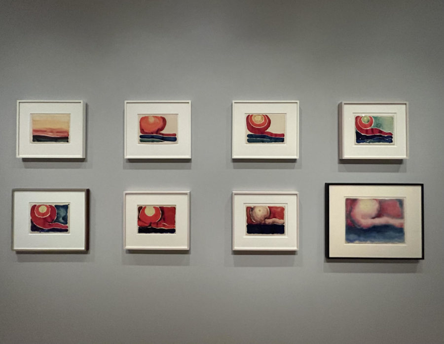
Georgia O’Keeffe captures a scene as simple as a sunset in eight parts.
“To see takes time” said American artist Georgia O’Keeffe about the formation of friendships. Accustomed to a slow-paced lifestyle, owing to her upbringing on a farm near Sun Prairie, Wisconsin, she believed that excellence came gradually. To sketch, to paint, and to see take time – so too did the debut of her illustrious career.
O’Keeffe first emerged as a renowned artist during the early twentieth century, beginning from 1915 to 1918. It was during this period that she released artworks at her fastest pace, completing roughly as many drawings over these three years as she would for the rest of her life.
Currently, the Museum of Modern Art is exhibiting ‘To See Takes Time,’ an exhibit of Georgia O’Keefe’s works in “charcoal, pencil, watercolor, and pastel” until August 12th, 2023.
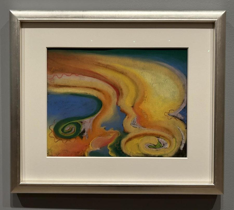
Among them was Special No. 33, created in 1915 using only paper and pastels. The abstract piece was meant to symbolize O’Keeffe’s love affair with the academic Arthur MacMahon, according to a letter addressed to her friend, Anita Pollitzer. “He got me to put my feet in [the water] because he said the motion of the water had fine rhythm,” she wrote in the letter. In swirls of blue and yellow hues, O’Keeffe attempts to mimic this rhythm by encapsulating the flow of a stream.
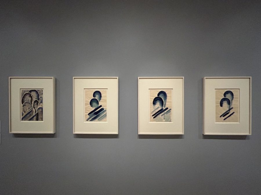
Just two years later, she would continue to replicate scenes from the natural world in her eight-part series of ‘Evening Stars,’ with all but the first assigned No. I through No. VII following its name. Beginning with lines of neatly isolated colors and ending in a tranquil haze, the progression of the watercolors is reminiscent of a sunset’s evolution throughout the evening. In order to best evoke an image of the sky’s final blur of color before night formally falls, O’Keeffe opted for a long-fibered paper texture that purposefully diffused the pigments together.
The newly massive scale of her subjects was likely inspired by her move to Canyon, Texas in 1916. This drastic change in scenery – demanded by her teaching job at West Texas State Normal College – introduced O’Keeffe to sprawling skies and limitless landscapes, embodying a “feeling of bigness” that the artist wrote “carries [her] away.”
Her new surroundings included a train that cut through the luscious greenery, with its quotidian early morning arrival prompting a rather iconic title to the charcoal drawing, Train at Night in the Desert. The artist took notice of the locomotive’s bright light and trail of smoke, capturing the latter in bright watercolor and the former of sweeping strokes of charcoal.
Similar materials were utilized in the creation of the triad Untitled (Abstraction/ Portrait of Paul Strand). The colors’ thin nature causes them to seep into each other, culminating in a figure that is almost entirely lacking in shape. Vague lines encircle a darker center amidst a light background, but do not resemble a human figure to the untrained eye. To O’Keeffe, however, the work is “almost photographic.”
A more defined, geometric element is present in Early No. 2, a 1915 charcoal piece. Within it is an element of the infinite, with dark spirals of various sizes outlining each other, as if pantomiming an ocean wave. Each of them begin at the bottom left corner of the paper and have crests in the top right, traveling the entire length of the page diagonally. Thought-provoking and ever-repeating, the curves are emblematic of life’s progression.
O’Keeffe opts for the opposite of these sinusoidal figures in yet another three-part series of straight lines. First Drawing of the Blue Lines, Black Lines, and Blue Lines X, all completed in 1916, are essentially identical. Each consists of a thicker, straight line to the right of a thin line bent at an angle. They marked the beginning of O’Keeffe’s use of color, with the exceedingly subtle touch of blue resonating with her “blue self.”
She would later embrace this coloration more wholeheartedly through No. 8 – Special (Drawing No. 8). Her inspiration behind this oeuvre was the wooden spiral of her violin handle, with rich hues of black directing viewers’ attention to the center of the page. Fascinating though it may be, the ubiquity of such black and white works in the exhibition grew redundant. Perhaps O’Keeffe felt the same, recreating the original charcoal drawing in blue watercolor after its completion.
What color could not accomplish, according to the artist, is the capacity of charcoal to express a physical feeling. Special No. 9, for one, encapsulates the sensation of a headache. “It was a very bad headache at the time that I was busy drawing every night, “ said O’Keeffe, “sitting on the floor in front of the closet door.”
She returned to color in a quartet of watercolors, Blue #1 to Blue #4. The transition of the first to the fourth work in the series is a purposeful shift from busy to simplistic, with dots covering nearly the entire canvas in Blue #1 to isolated curvatures in Blue #4 and an evident overlap in between.
Red began to appear in O’Keeffe’s works in 1917, beginning with No. 20- Special. Its subject is the Palo Duro Canyon in Texas and the trademark cedars that line its opening. The trees and “slit in the ground” are depicted in bright red, with the sky above them represented in a starkly contrasting dark blue.
O’Keeffe would translate the massive mountains onto a minuscule canvas four more times that year in Pink and Green Mountains No. I through IV. The title is self-explanatory; the vast scale of the Rockies is simplified into bands of pink and green, though they are of a different brightness in each rendition of the watercolor painting. The artist consciously omitted various parts of the paper from such pigmentation, with the ‘blank’ spots symbolizing either snowy patches or clouds.
A year later, House with Tree-Green was released. Three trees line the foreground before a full moon in both this version and the smaller, blue-hued rendition of the same scene. Onlookers’ view of the moon is obscured by the greenery before it, a style inspired by Arthur Wesley Dow, who taught O’Keeffe in a class at the Teacher’s College at Columbia University.
Over Blue marked a distinct return to more abstract images. The piece features a deep blue cavern lined by folds of white and light, mellow colors. Despite O’Keeffe’s shift to oil paint after moving to New York in 1918, she continued to use pastels for the gradience of their color, with Over Blue being a prime example. Nevertheless, its smoothness can be credited not to this material but to the use of the artist’s fingers, which rubbed the pigment into the paper. Unable to blend pastels with the stroke of a brush as she would oil paint, O’Keeffe employed her hands, which proved to be an even simpler tool.
Decades later, she began to integrate natural scenes of a smaller scale into her artworks. Goat’s Horns with Blue utilizes the curvature of a goat horn as both a lens through which viewers see the background and as the painting’s primary subject. Having moved to New Mexico in the later portion of her career, O’Keeffe modeled the 1945 piece after the animals she commonly observed around her each day.
This painting is the last on view in the MoMA’s exhibition ‘To See Takes Time,’ and rightfully so. It differs so apparently from the first drawings on view, that the stylistic changes of O’Keeffe’s career are perfectly highlighted through the order in which the pieces are positioned. Though the serial nature of some became repetitive to some extent, the ever-so slight differences between them also spoke to the evolution of the different works. These changes, however, just as ‘to see,’ truly do ‘take time.’
“He got me to put my feet in [the water] because he said the motion of the water had fine rhythm,” she wrote in the letter. In swirls of blue and yellow hues, O’Keeffe attempts to mimic this rhythm by encapsulating the flow of a stream.
Sela Emery is a Copy Chief for 'The Science Survey.' She focuses on art history, covering relevant art pieces and exhibitions with each issue. In addition...